UI case study
LiquidLabs
How might we get more people to try a juice-cleanse alternative?
LiquidLabs is not a fad diet and wants to help women ages 30-45 to continue to live their best lives while feeling good and looking great doing it.
“Busy urban professionals are looking for easy and healthy options that don’t feel like another chore in their lives.”
What
Through user interviews, we discovered that our audience is a little cautious when it comes to trying juice cleanses. If they’ve done one before they had a negative opinion because it left them feeling more burnt out instead of energized. But they are willing to try it, especially if it’s not only a cleanse, but more about health and well-being.
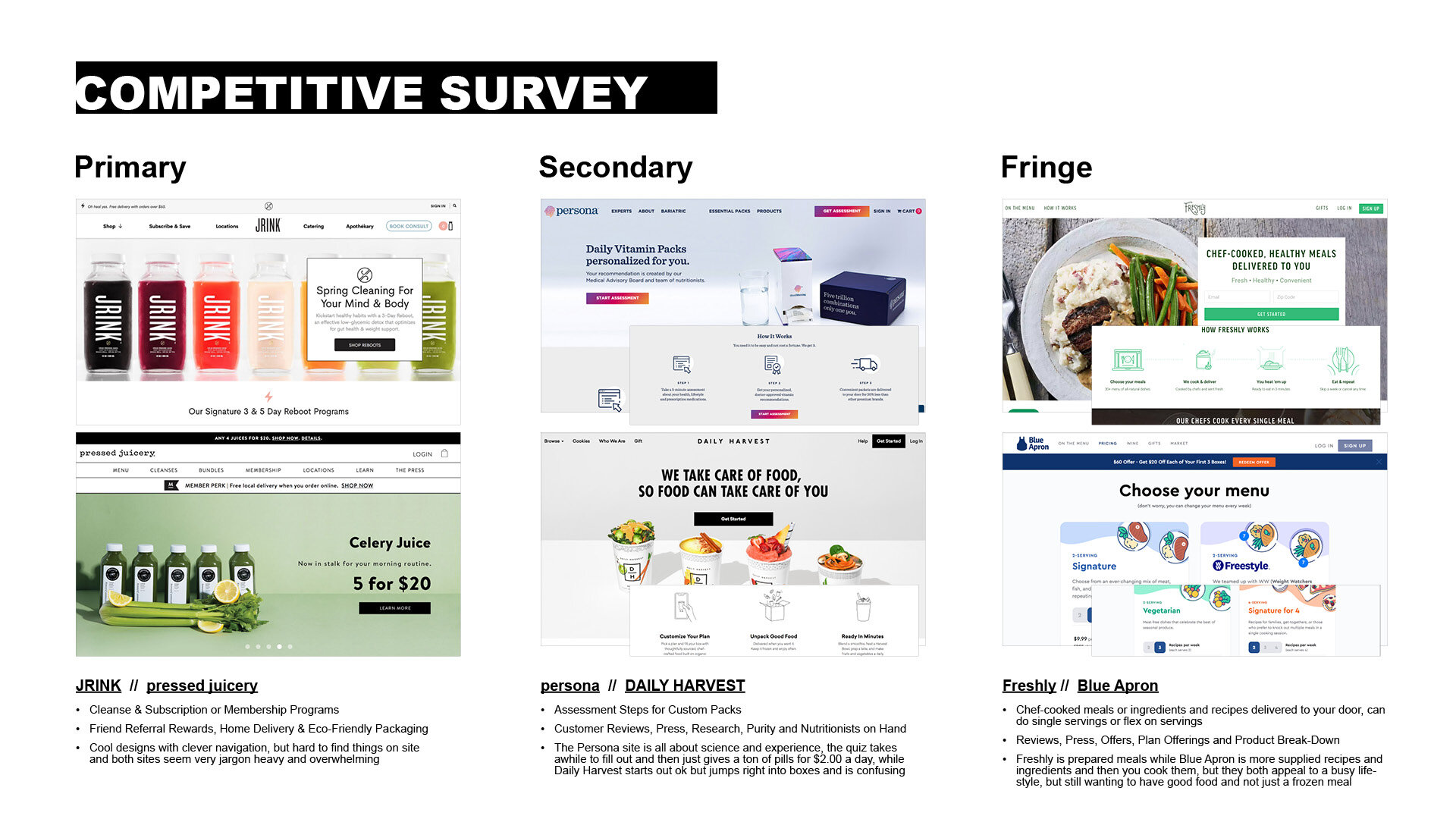
In our competitive analysis, we took a broad approach, looking at not only category competitors, but vitamins and other prepared food delivery services. A lot of them had clean sites, but some were really hard to navigate and just get straight to what you’re ordering. They also all looked very similar showing simple pastel colors and product shots. So, we decided to take a look at other brands that may appeal to our audience where more of those brands were all about health and body positivity.

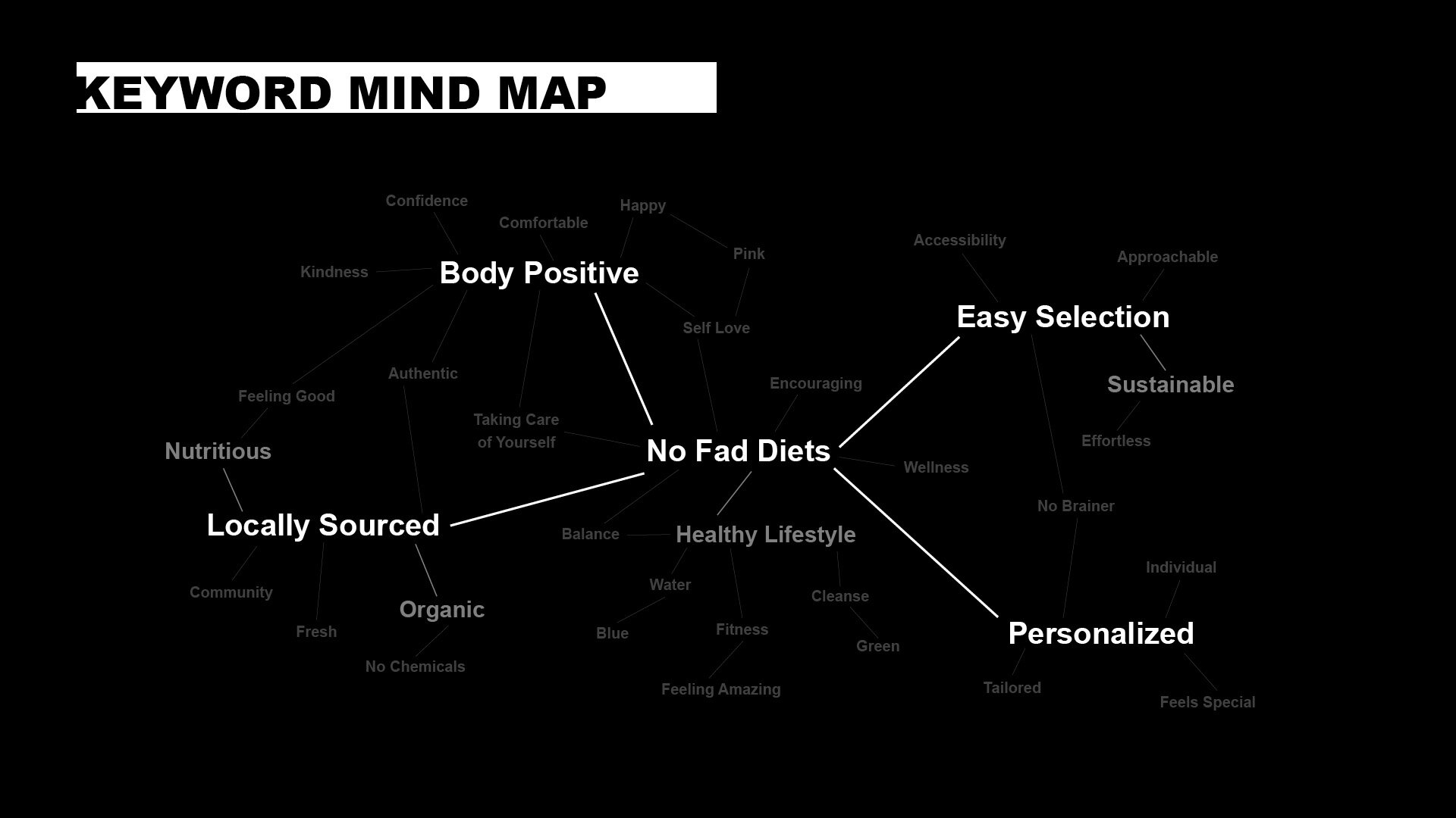
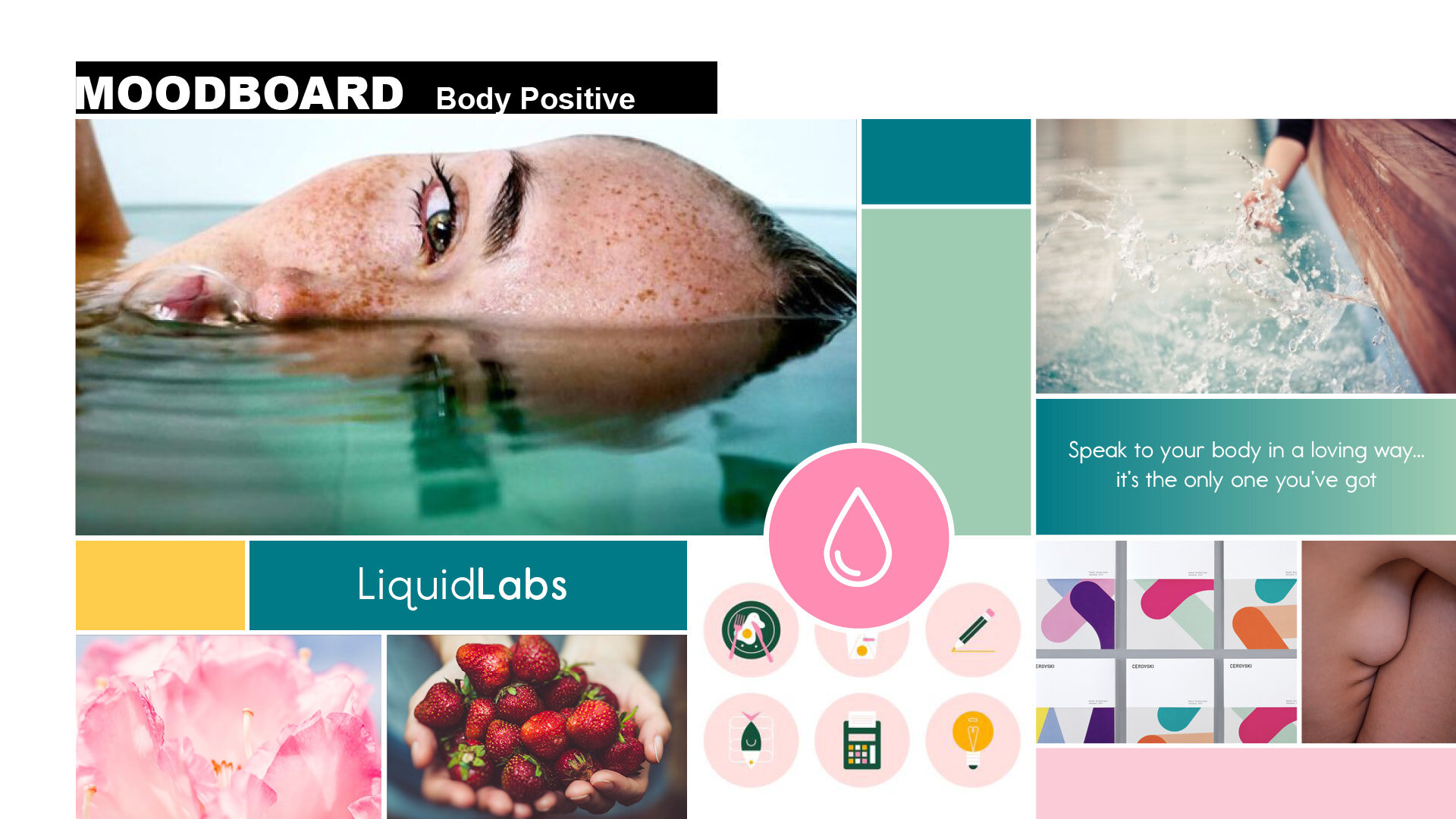
This research led us to focus on “No Fad Diets” as our mantra for the brand. We explored body positivity as well but landed on making our brand look and sound like a real person. We continued that feel through the next stage in developing the brand and website.


How
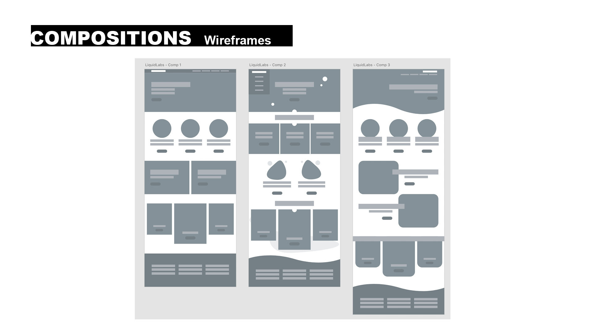
Once we honed in on our direction, we created sketches and wireframes, using simple shapes and lines that could play off of each other. Then, we dug into the photography style and decided to show real people living their best lives. We also decided to show the fresh ingredients of the juices instead of product photography to stand out from our competitors and to help the audience make more of an emotional connection to what is in the juice.

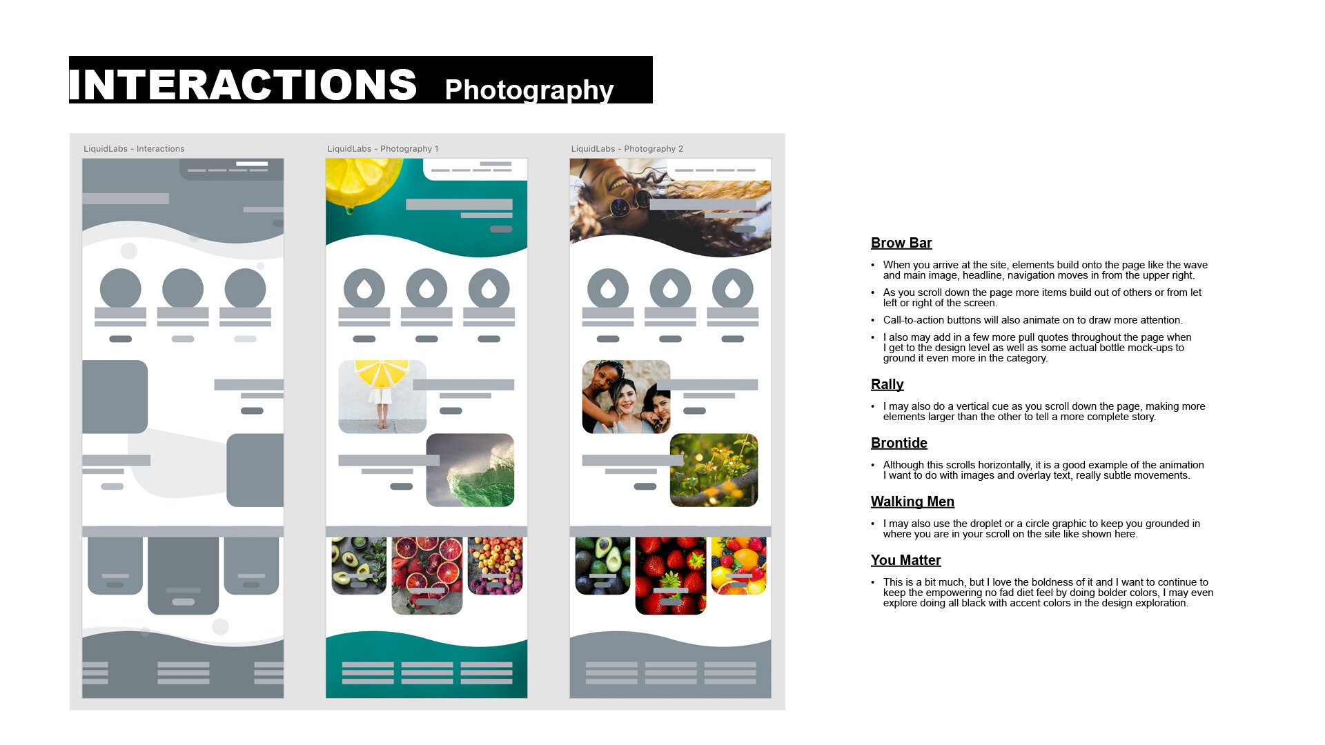
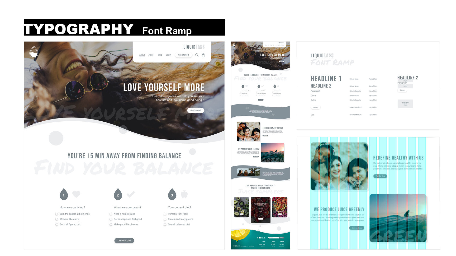
Our copy also reads like a real human and starts out with a quiz to figure out what juice makes the most sense for your specific lifestyle. The fonts and colors we chose are fun and playful, but fresh and appealing. We conducted more research and usability testing with this content. That lead us to fully develop the color palette and make changes to the Juice Sampler section to make sure that the names stood out for each of the juices.
Why
Our goal was to bring this small, privately owned cold press juice bar to life and stand out in a very saturated market. The new website allows LiquidLabs to provide custom juice services, easy starter packages and healthy living resources to their down-to-earth customers. Because, they know that if you incorporate more fresh fruits and veggies into your lifestyle you can reach your full potential.
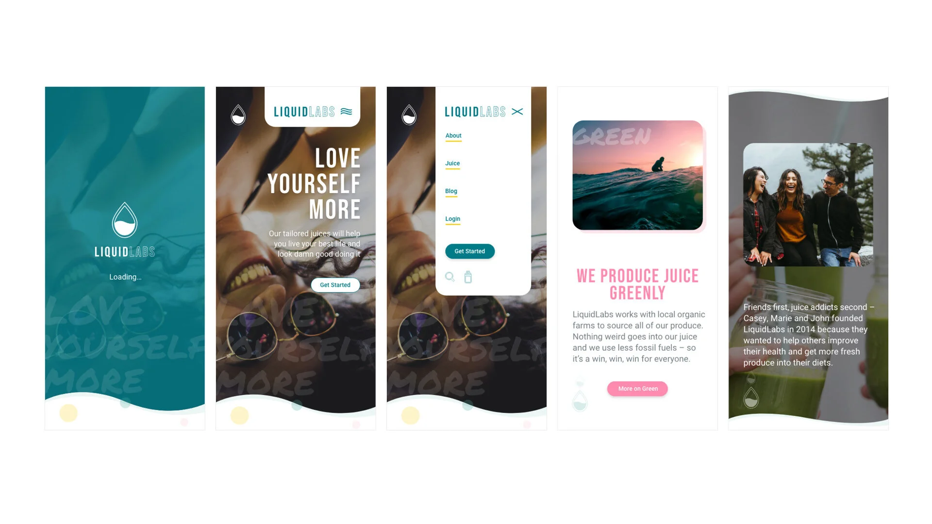
We created both desktop and mobile prototypes to show rollover and button states for further user testing.

Tools + Methods
Adobe Illustrator
Adobe Xd
InVision
User-Centered Research
Data Analysis
Persona Development
Sketching
Wireframing
Visual Design
Rapid Prototyping
Identity Development
Copywriting
Graphic Design


